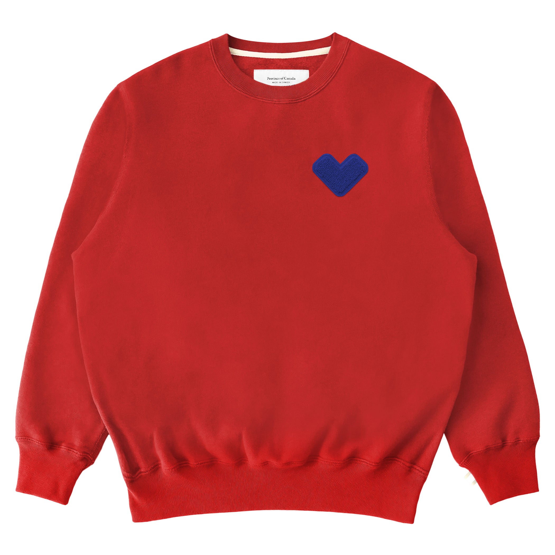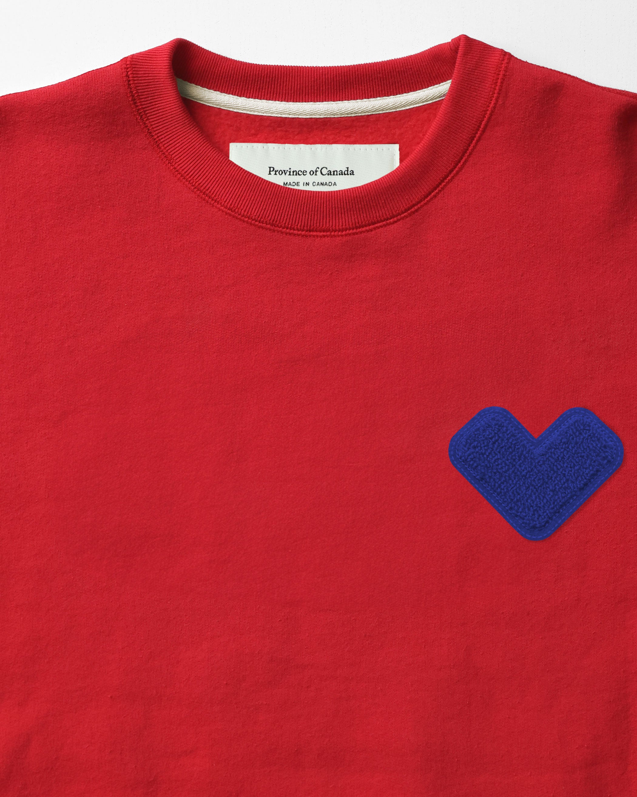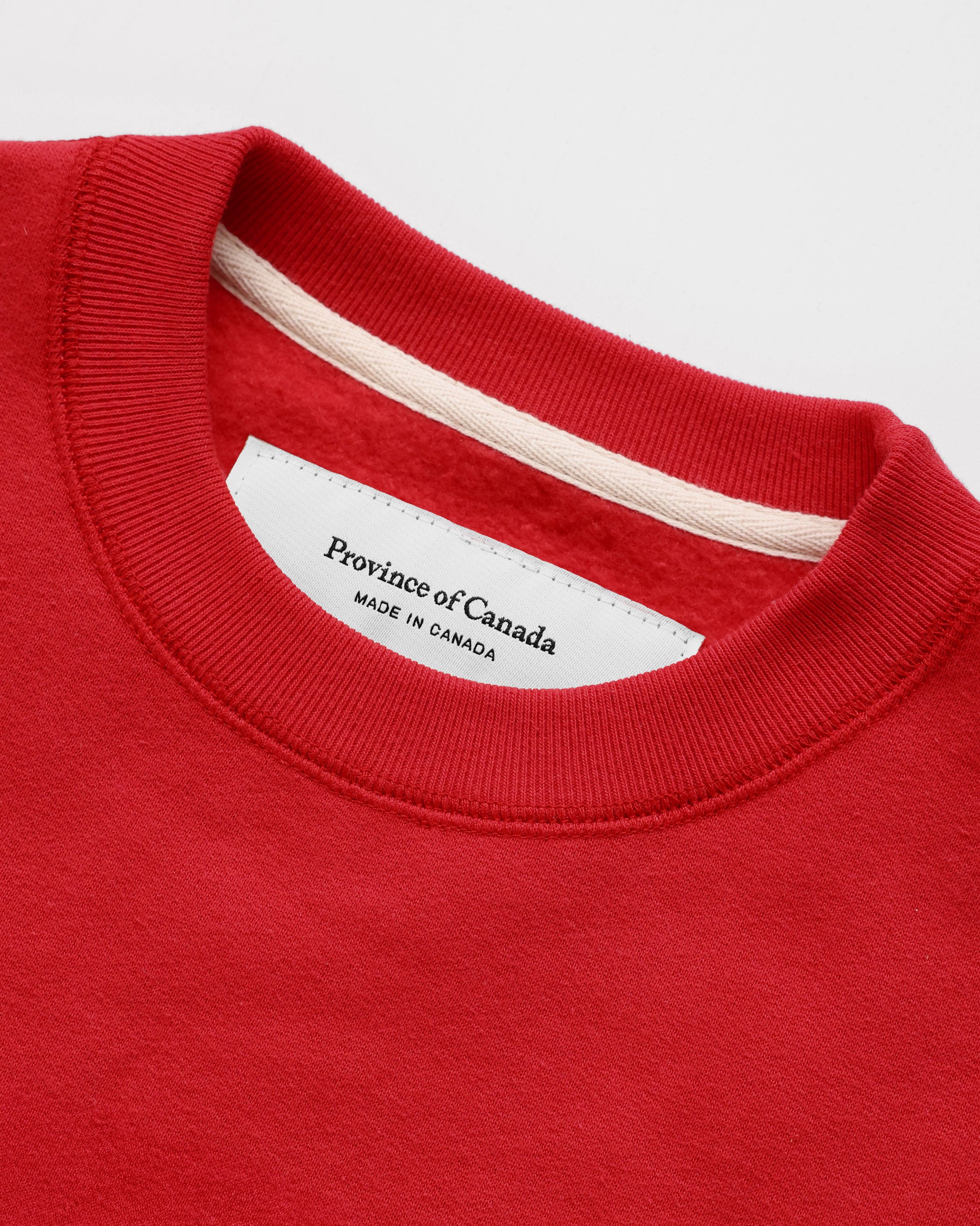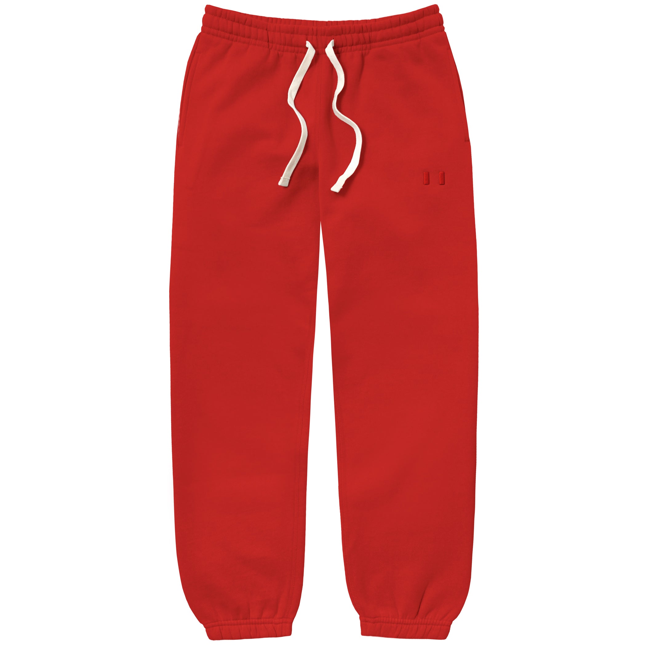
Have you noticed anything about Pantone's colour of the year? When we launched our rebrand this fall, we had no idea that we were accidentally prophesying the colour of 2019. Our faded red is within the same world as coral and reads similar to Pantone's 16-1546 TCX.

Since launching Province of Canada in 2014, we set out with the goal of exploring new Canadian stereotypes. We've intentionally avoided traditional Canadian stereotypes and, instead, focus on creating designs that offer a refreshing take on Canada with pieces that are 100% made in Canada. This pursuit made us vow to never use red in our designs.
It wasn't until we came across a washed red fabric for our French Terry Crewnecks that we realized a toned-down red was the perfect way of representing our brand's commitment to designing toned-down interpretations of Canada. This sparked our relationship with faded red, which, to us, was the only kind of red that made sense for our brand.
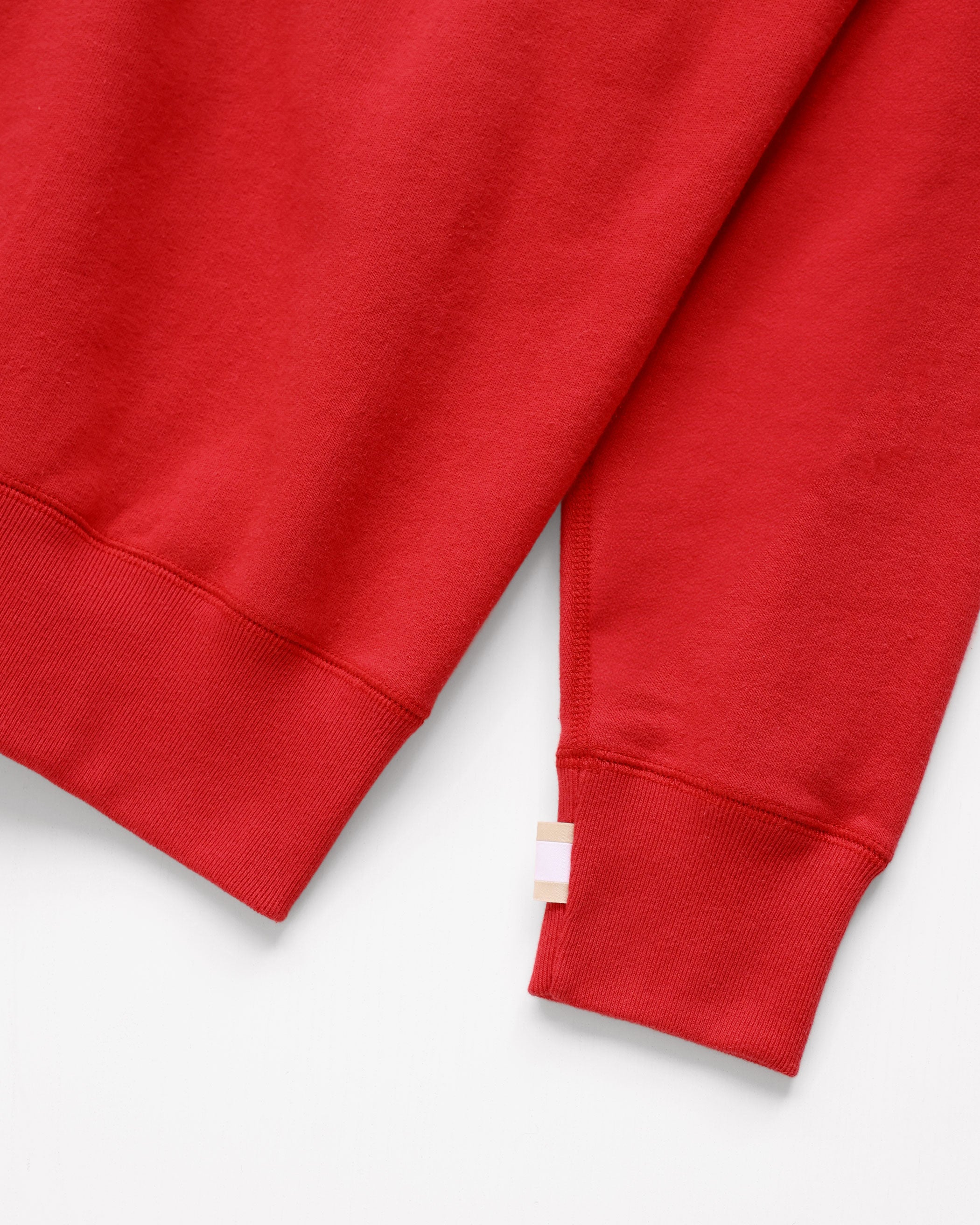
When we eventually launched our rebrand in Fall 2018, we decided to incorporate faded red into our logo with a tri-colour flag. The flag, in many ways, represents what Province of Canada has always strived to be - a stamp of approval on a garment to communicate, 'this piece was designed in Canada and made in Canada by Province of Canada.'

The faded red, or as we know it, Pantone 2030 that exists on this little flag has been injected into many of our pieces; our Club Canada and Logo Collections, and our our Faded Red Stripe Socks, to be specific. While we could have never actually predicted Pantone's colour of the year, it does seem like a good omen that validates a step in the right direction for our brand in 2019.


